If this is your company, CONTACT US to activate Packbase™ software to build your portal.

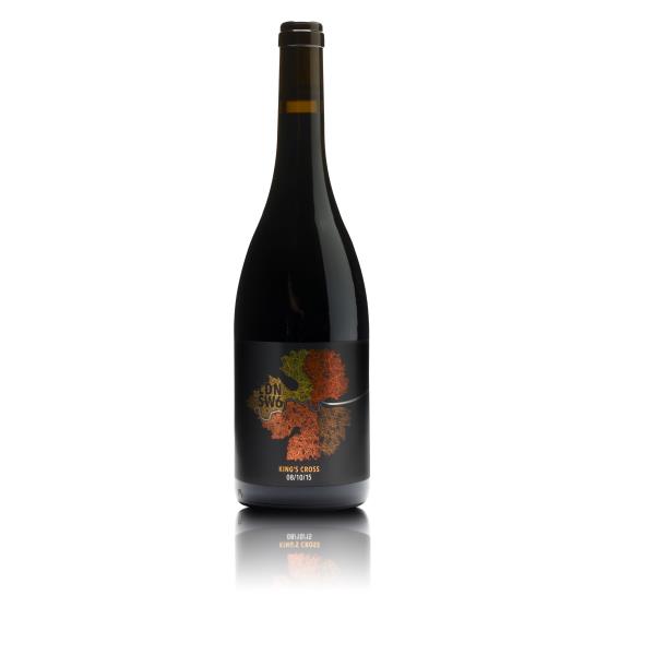


Last year at the FINAT awards, Royston walked away with a trophy for their Eco Soapia packaging. This year, they not only bagged two category trophies, but were also awarded Best in Show for their stunning London Cru Kings Cross wine label.
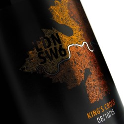
As the capital’s first and only winery, London Cru are forever drawing inspiration from the city itself. When dreaming up the packaging for their new Kings Cross blend, they wanted to play on the London theme with an image of the River Thames set against a striking metallic map – and Royston were only too happy to deliver.
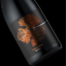
The finished label shows the river winding through four different metallic foils, printed against a deep black background, and with selected areas varnished in gloss or matt to boost visual appeal. A combination press was used to print the label, increasing registration and the quality of the final result.
Matching the foils to the desired shades and achieving the fine detailing wasn’t easy but – considering Royston’s award success – the effort was certainly worth it. Most importantly, the client was thrilled: “Royston provided a finished product which delivered perfectly to specification. I would not hesitate to work with them again on future projects!”