Case Study: P28
more...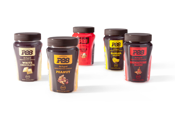
Case in point is the P28 project. The P28 brand is all about changing the game and they needed a package redesign and a decoration method to go along with that notion. The company was launched by three brothers in the baking business who decided they needed to get in shape and lose weight. Initially, they turned to exercise and nutrition but when that didn’t produce results, they turned to their personal trainer and nutritionist. In 2008, the brothers plus one introduced a bread and an original high protein spread.
Originally, the high protein spread was packaged in a “peanut butter style” jar and wasn’t well differentiated nor was it disruptive on shelf. According to Jeff Prince, Director of Operations, P28, “We wanted to get away from being just another typical spread jar on the shelf. We chose TricorBraun because of their game changing design capabilities, the quality of their work and their top notch communication.”
According to Samantha Juna, Package Design Manager, TricorBraun, “We looked at a variety of shapes, closures and different deco methods including labeling versus shrink sleeving the bottle but the big turning point came when we agreed to play up the sports angle and truly differentiate from a regular peanut butter. We explored surface changes, more pronounced textures and athletic silhouettes. We took inspiration from some of the sport drinks on the market. We essentially left the peanut butter category and went to nutraceuticals.”
Additionally she states, “The first approach was to take the original artwork and conservatively make it work with the new structure but P28 felt that a more playful look was needed while retaining the established sku colors and the logo positioning.”
The final artwork includes opaque areas where the text is clearly readable. This leads to a vignette that accentuates the shape and then a clear arch that reveals how much product is left.