Public
 Robinson Capabiities
- Robinson Packaging Catalog
 Robinson Packaging Documents
 Robinson Packaging Gallery
 Robinson Packaging Innovation Videos
 Robinson Packaging Locations
 Robinson Packaging News
- Robinson Packaging Showcase 3D Models
If this is your company, CONTACT US to activate Packbase™ software to build your portal.


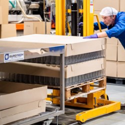
Robinson – the leading manufacturer specialising in value-added custom packaging – is starting the new year with a dynamic, refreshed, radical rebrand.
The modern, new look Robinson – formerly Robinson Packaging Innovation – is the result of investment into months of intense external and internal research into the evolving packaging market and the markets we serve, offering unique insights into customers, competitors, from employees, and the status of the company, while aligning with our strategic direction. The heritage, values and personality of the brand have been brought to life in a confident, striking new look and strategic blueprint.
The research demonstrated that Robinson’s identity is refreshingly real and honest; always agile, working flexibly and responsively with its customers as a trusted partner, completely committed to its customers’ success.
CEO Dr Helene Roberts says the rebrand is a stimulating development for the company. She says: “We are staying true to ourselves, reflecting on who we really are as a company today – we are and always have been very proud of our heritage. We have been in the packaging business for more than 180 years but need a brand that remains relevant and supports our ambition, captivating to our customers and aligned with the future of the industry. We lead our business with a purpose to go above and beyond to create a sustainable future for our people and our planet, and our revitalised identity reflects this.”
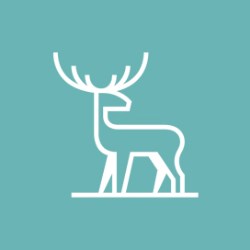
The new logo has been handcrafted to reflect the Robinson character, which is defined as confident and straightforward. It is complemented by a modern Stag icon, which was the old family crest of the Robinson family and based on the company’s original registered trademark for surgical dressings. It was used from Robinson’s inception in 1839 through to the 1930s. Dr Roberts says: “The stag is Robinson’s connection to its history and its people, with our modernised symbol representing the close-knit family business we still are today”.
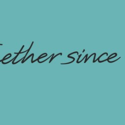
The company’s new sign-off says simply ‘Together since 1839’ and is designed to represent the proud, unique heritage of a dependable partner with a collective spirit that goes above and beyond to get the job done and which is truly working towards a more sustainable future.
The colours replicate Robinson’s personality and help differentiate them, with teal being their new core brand colour, which is open, calm, and natural. The brand’s supporting palette of red, yellow, grey, black and white complement the core teal colour and bring depth and optimism to the broader brand world.
The change in branding is reflected in both visual and verbal identity. Lubna Edwards, Sustainability and Marketing Director, is working with the entire team at Robinson to showcase the new branding internally and externally. She says: “We are building a committed culture by applying our core values and behaviours in everything we do – being honest, agile, empowered and engaged – that’s how we do business.
As an organisation, we are genuine, open, and trusted in our knowledge and delivery. Our small business allows us to be nimble and to work flexibly and responsively to keep on track and maintain a speed of execution while being a provoker of change. We have comprehensive initiatives to help our people thrive while doing things better in our processes and operations. We are trusted by our customers – it’s why they keep coming back and why we continue to attract more. We believe our new branding that comes from our DNA is not just a change of logo; it really reflects who we are and will be in the future.”
The Robinson roll out of the new branding will be followed with the announcement of a new website and sustainability pledge.